
Impact
+147% increase in user engagement

Post-launch, we saw an impressive 147% increase in feature engagement, signaling strong product market fit in the overall user experience
40% of Users Reported Less Stress

Users told us they were feeling much more confident and in control over their wedding budget and estimations after launch
Context
Wedding planning is stressful and Nupt.AI's budget tool was making it worse. Users were dropping off before completing the estimator because the interface felt rigid, untrustworthy, and overwhelming. I led the full redesign of this feature over 8 weeks, transforming it from a static form into a dynamic, AI-powered experience.
The result: a 147% increase in feature engagement and 40% of users reporting significantly less stress around budgeting.
My role
I was the sole designer on this feature, responsible for every phase: research, ideation, prototyping, testing, and developer handoff. Over 8 weeks I worked in close collaboration with our founder and engineering team, shipping a redesigned estimator and creating 15+ reusable components and icons that extended the broader design system.
Identifying the Problem
Three pain points surfaced consistently across user research:
No flexibility — users wanted to estimate at a high level before committing to line items, but the tool forced premature precision.
Fear of being wrong — without location-based benchmarks, every number felt like a guess. Users didn't trust what they were entering.
Broken logic — edits didn't cascade intelligently. One change could throw the entire budget into an inconsistent state, eroding trust fast.
The impact was measurable: 48% of couples reported delays and a lack of meaningful feedback, causing them to abandon the tool before finishing.
Research
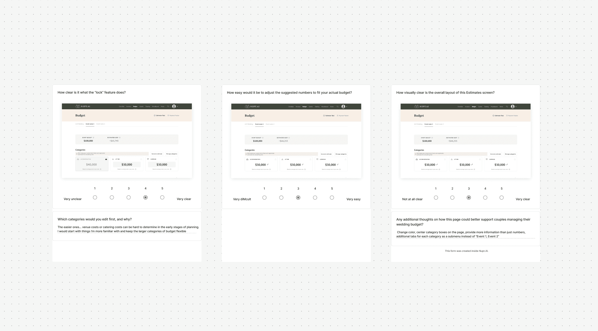
I ran usability tests with 5 users throughout the process, starting with early "lock" and "toggle" concepts to evaluate clarity and usability. Feedback from these sessions directly drove our biggest design pivots. I also ran A/B tests to validate decisions by measuring engagement and preference between feature variations.
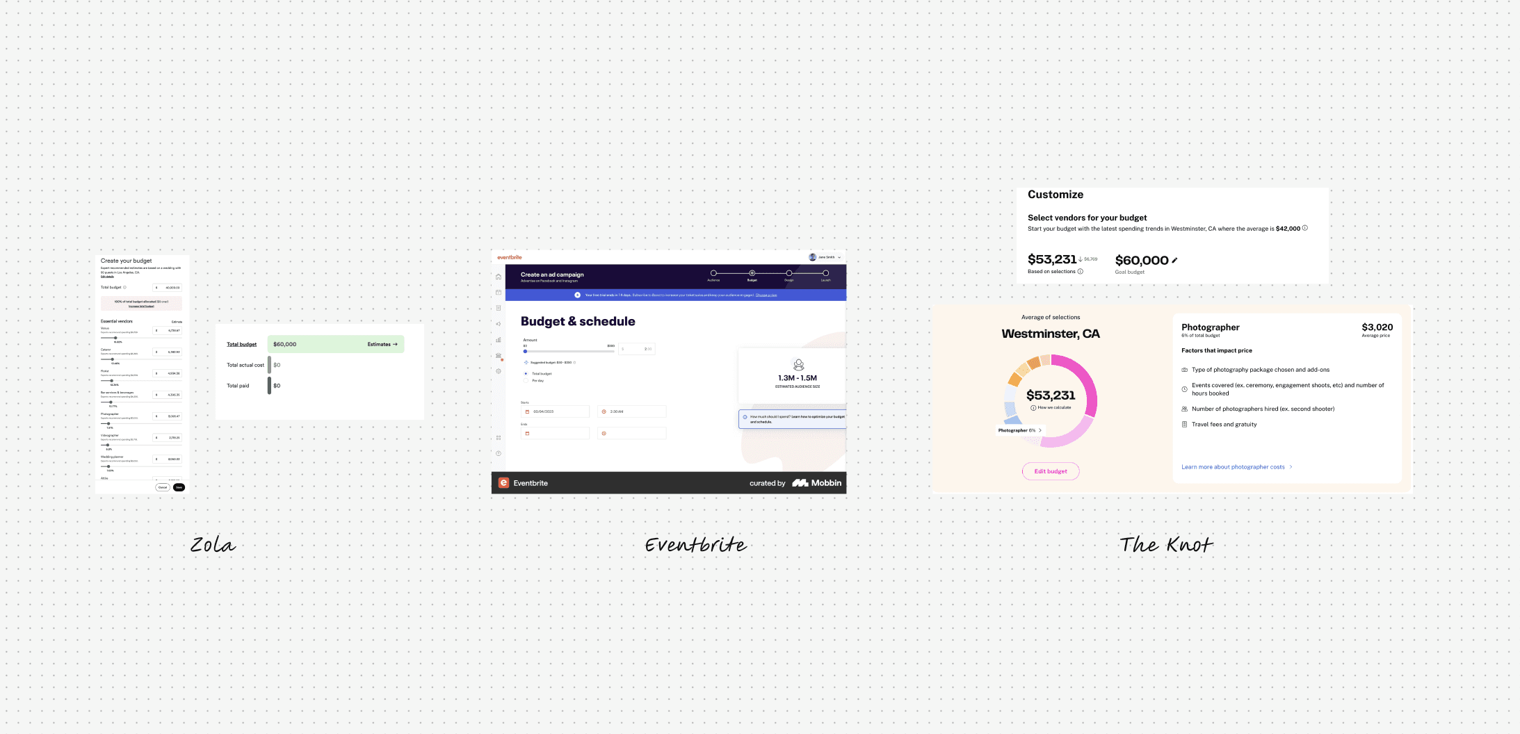
On the competitive side, I audited The Knot and Zola to map existing mental models — identifying what each did well (The Knot's location-based intelligence, Zola's visual spend tracking) and where both fell short. A heuristic evaluation of the existing tool surfaced clear violations in flexibility, feedback, and error prevention. I paired this with market research into wedding planning trends and Gen Z design preferences, which later informed the visual direction.
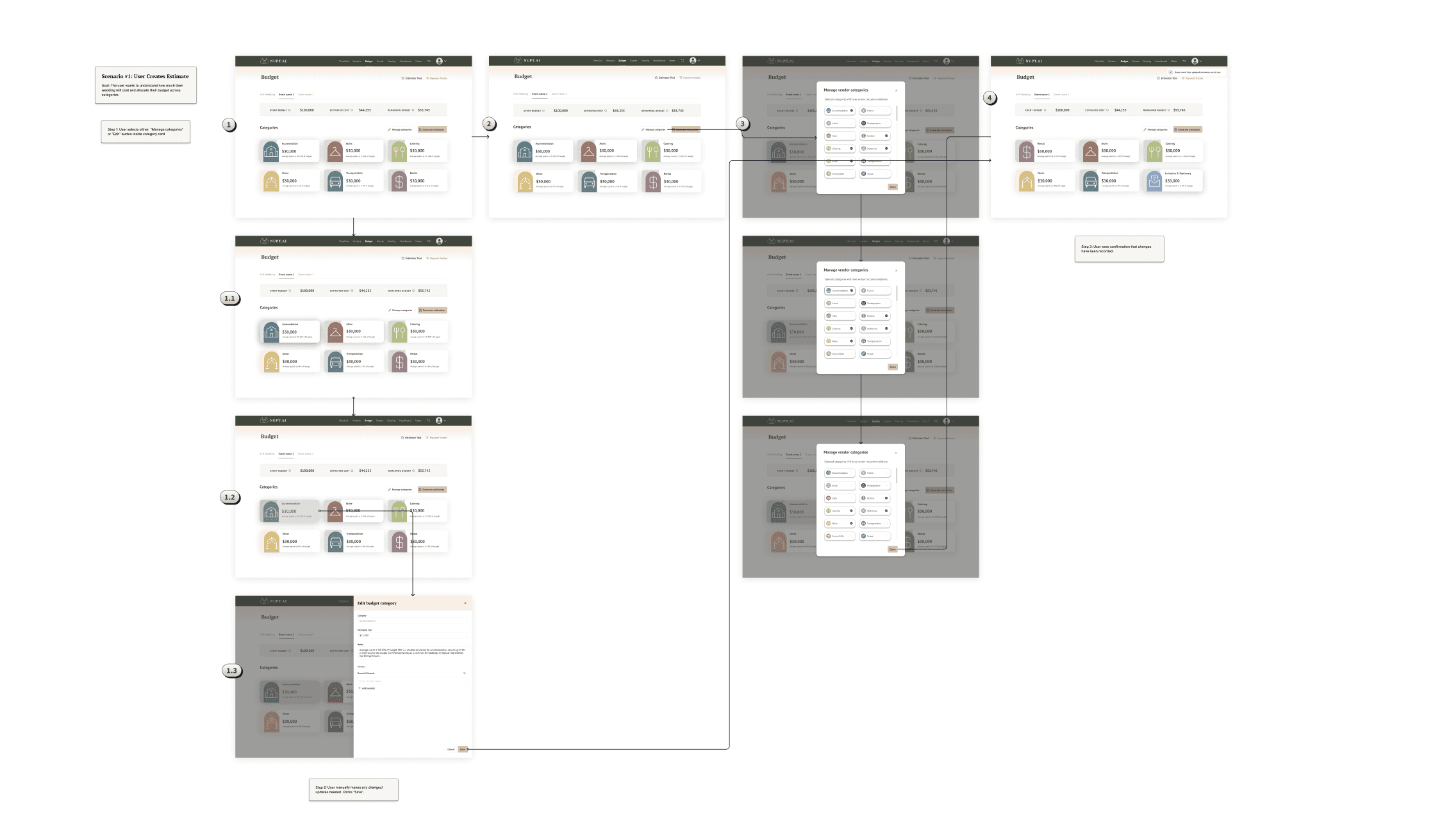
Design Decisions
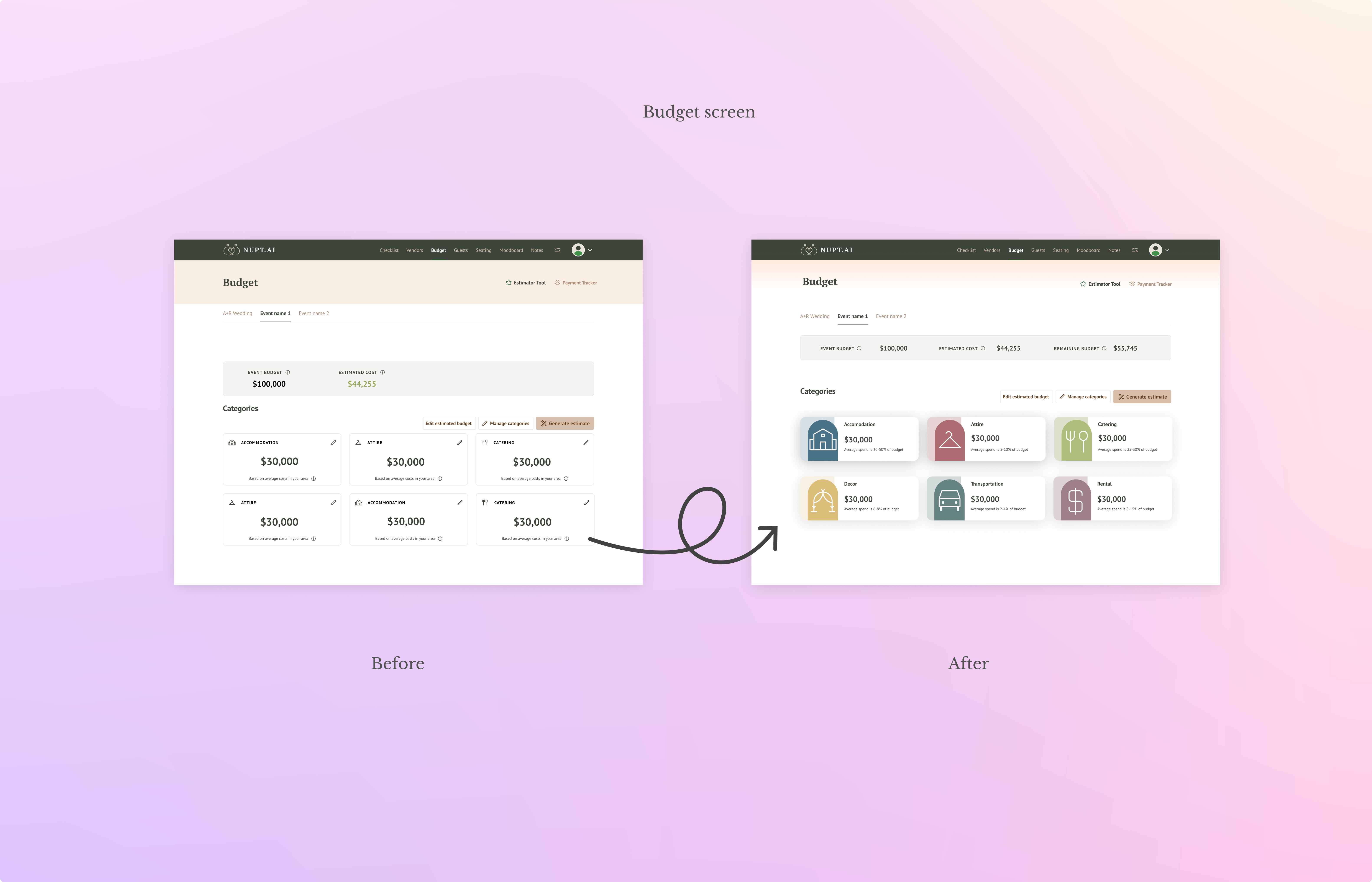
Killing the lock feature Early designs included a lock icon that let users pin certain categories while the AI recalculated the rest. It seemed clever in theory. In testing, 40% of participants rated it 2/5 on clarity — and the toggle alternative wasn't much better. Both concepts added cognitive load without solving anything. We cut the feature entirely and let the AI handle the math while users edit freely. It was the right call.
Choosing the right LLM Selecting an AI model for budget calculation was as much a product decision as a technical one. Gemini 2.5 Flash Lite was fast (10–15 seconds) but regularly broke budget constraints. ChatGPT 5.2 was inconsistent with instruction adherence. We landed on Gemini 2.5 Flash — slower at 30–45 seconds, but 95% accurate within constraints. We prioritized trust over speed, and users noticed.
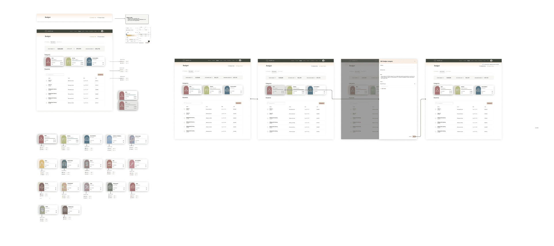
Shifting the visual direction Late in the process I noticed the category cards felt functional but joyless — more spreadsheet than wedding planning. I looked outside the category entirely, drawing from beauty and wellness brands like Ulta and Sephora to understand how to design for a Gen Z audience who expects delight. I introduced a warmer palette, rounded arch motifs as a nod to wedding arbors, and color-coded categories. The visual shift wasn't cosmetic — it changed how users felt about the tool before they'd entered a single number.
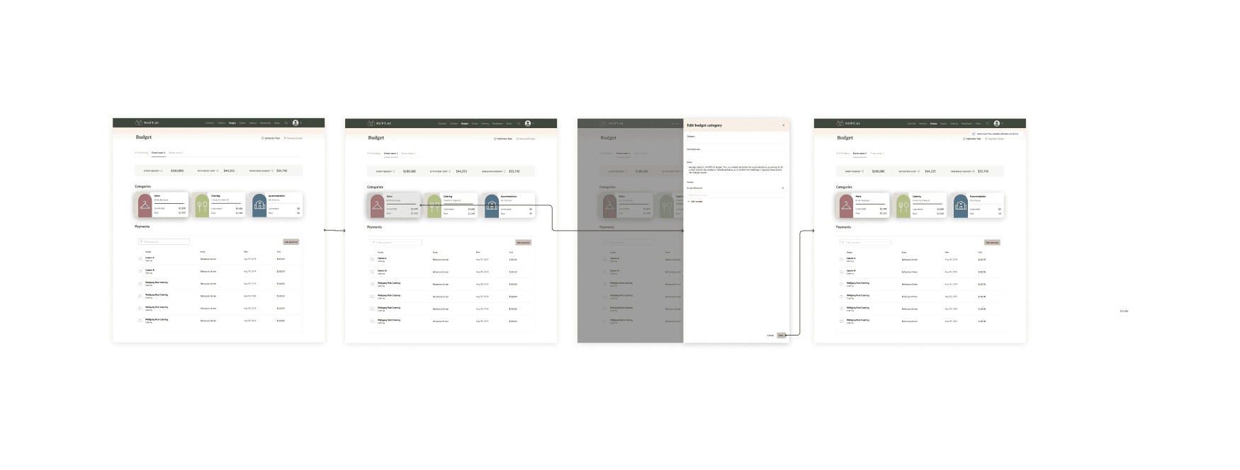
The Solution
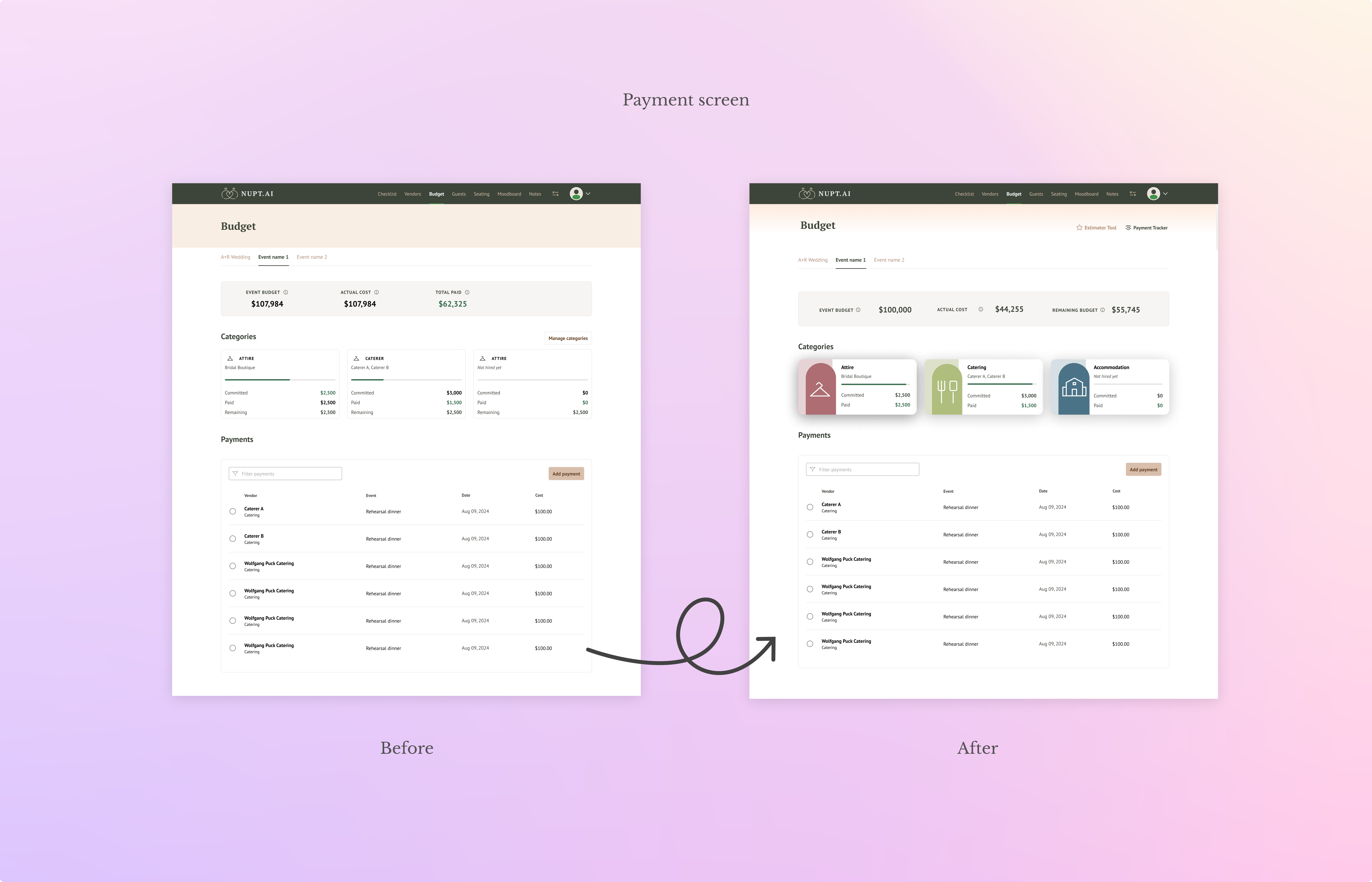
The final design centered on a two-tab structure — Estimate and Payments — that let users play freely with numbers before committing to anything. In the Estimate tab, the AI pre-fills budget categories based on total budget and location, eliminating blank-canvas paralysis and giving couples a realistic, trustworthy starting point. Simple Over/Under Budget indicators replaced the lock mechanic, keeping the interface clean and the math invisible. Once confident in their estimates, users move to the Payments tab to track actual spending against their plan.
Preparing for handoff
With the design finalized, I prepared a full set of developer-ready specs in Figma — covering component states, spacing, interaction behavior, and edge cases. The 15+ reusable components I created throughout the project were organized into a shared library with clear naming conventions, making it straightforward for the engineering team to implement and for future designers to build on.
Outcome & Demo Day
Post-launch, the redesigned estimator drove a 147% increase in feature engagement — a strong signal of product-market fit at the feature level. 40% of users reported feeling significantly less stressed and more in control of their wedding budget after using the updated tool.
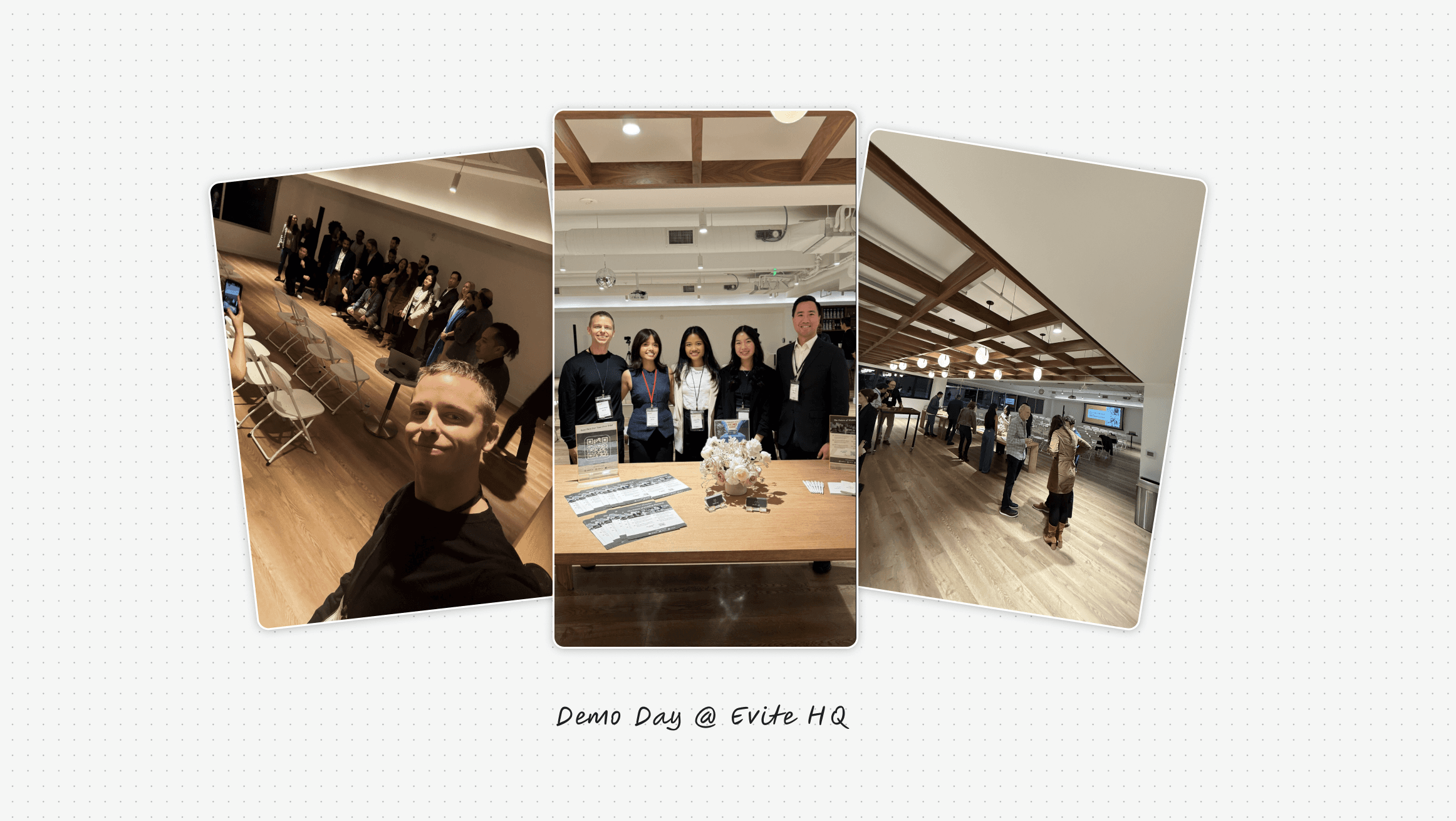
The project also gave me a chance to represent the team publicly — Nupt.AI's participation in FoundersBoost Glendale brought us to Demo Day at Evite HQ, where I had the opportunity to present our work in front of investors, founders, and mentors from across the tech industry.
Learnings & takeaways
One of the biggest lessons from this internship was learning to think in systems rather than in screens. Every feature exists within a larger flow, and users don't experience a product one component at a time, they move through it.
When information feels scattered, inconsistent, or asks too much of them, they leave. Designing with that in mind meant constantly asking: does this moment connect clearly to the one before it, and the one after?
I also got an inside look at what it takes to keep an early-stage startup alive. Features get cut, priorities shift, and design has to move fast without losing quality, all in service of metrics that directly determine whether the product survives.